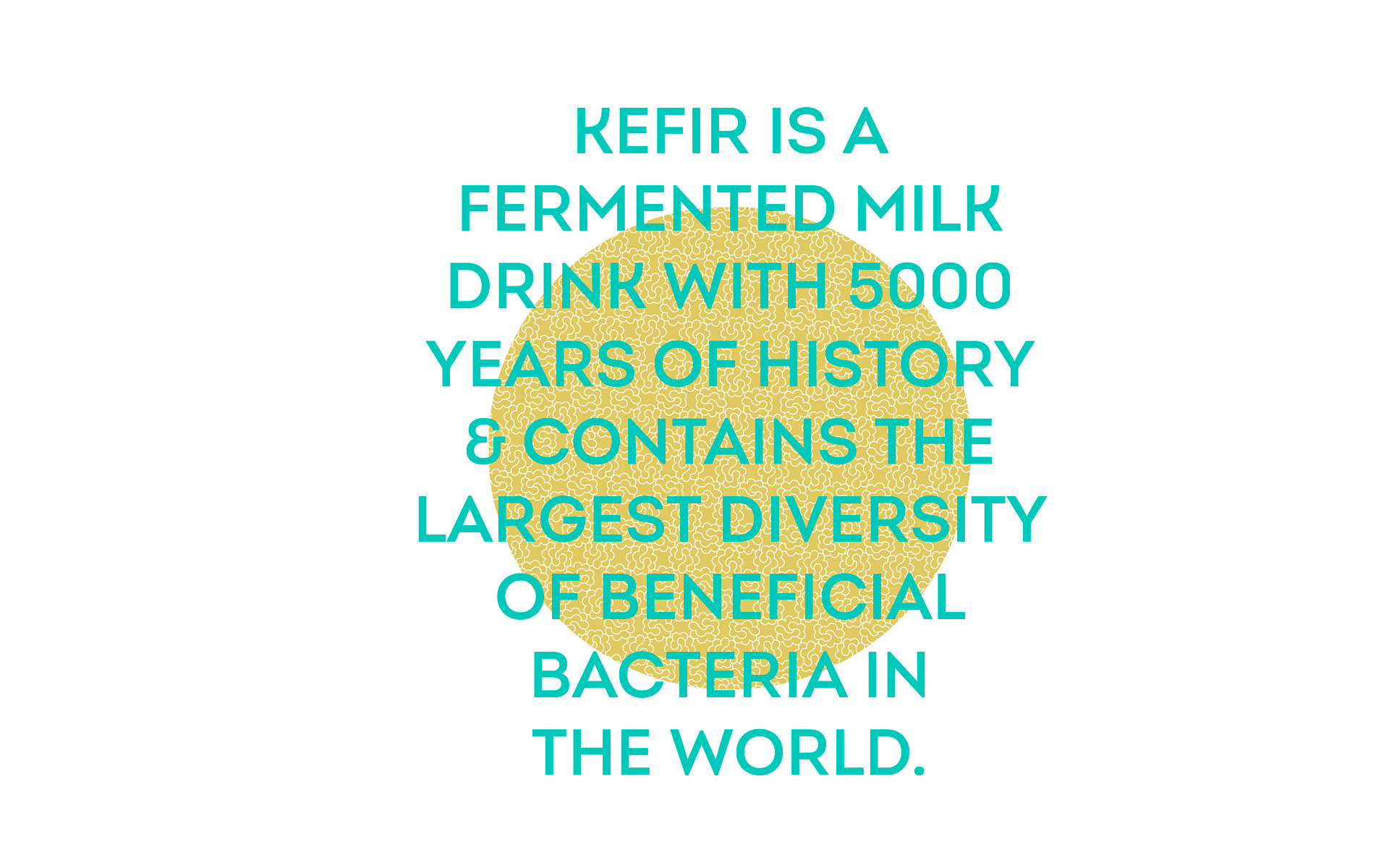
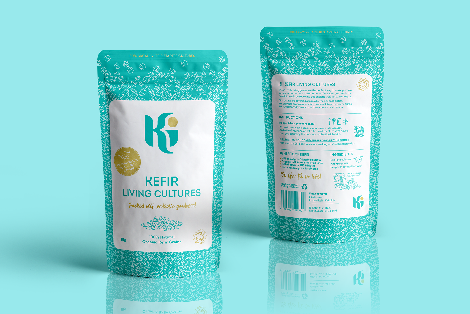
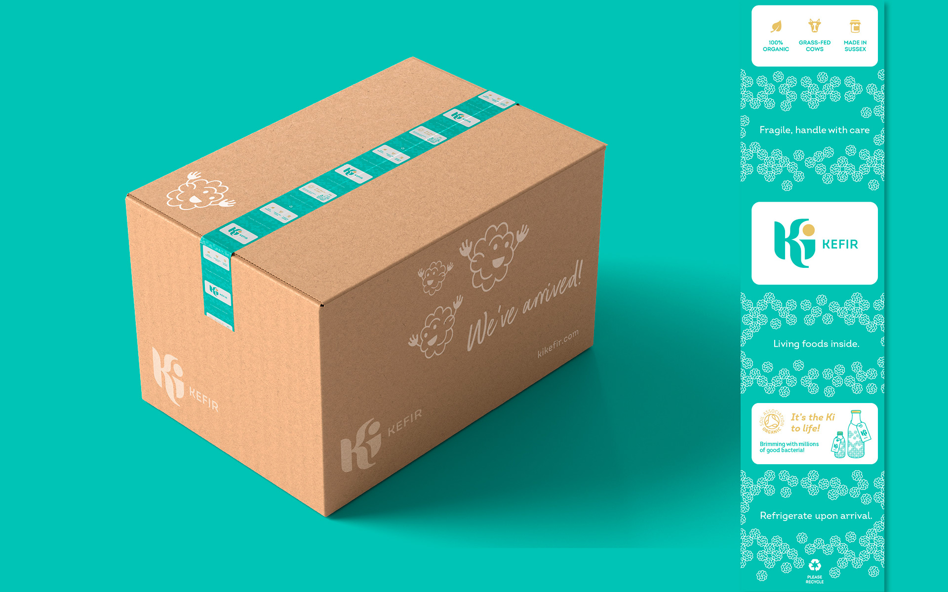
The curved letters of 'Ki' and the repeat pattern are a subtle nod to the art and rugwork style of the caucasus mountains regions where kefir originated. The gold dot of the 'i' is visually contained, representing the glow inside after drinking.

Web elements - site built using Shopify
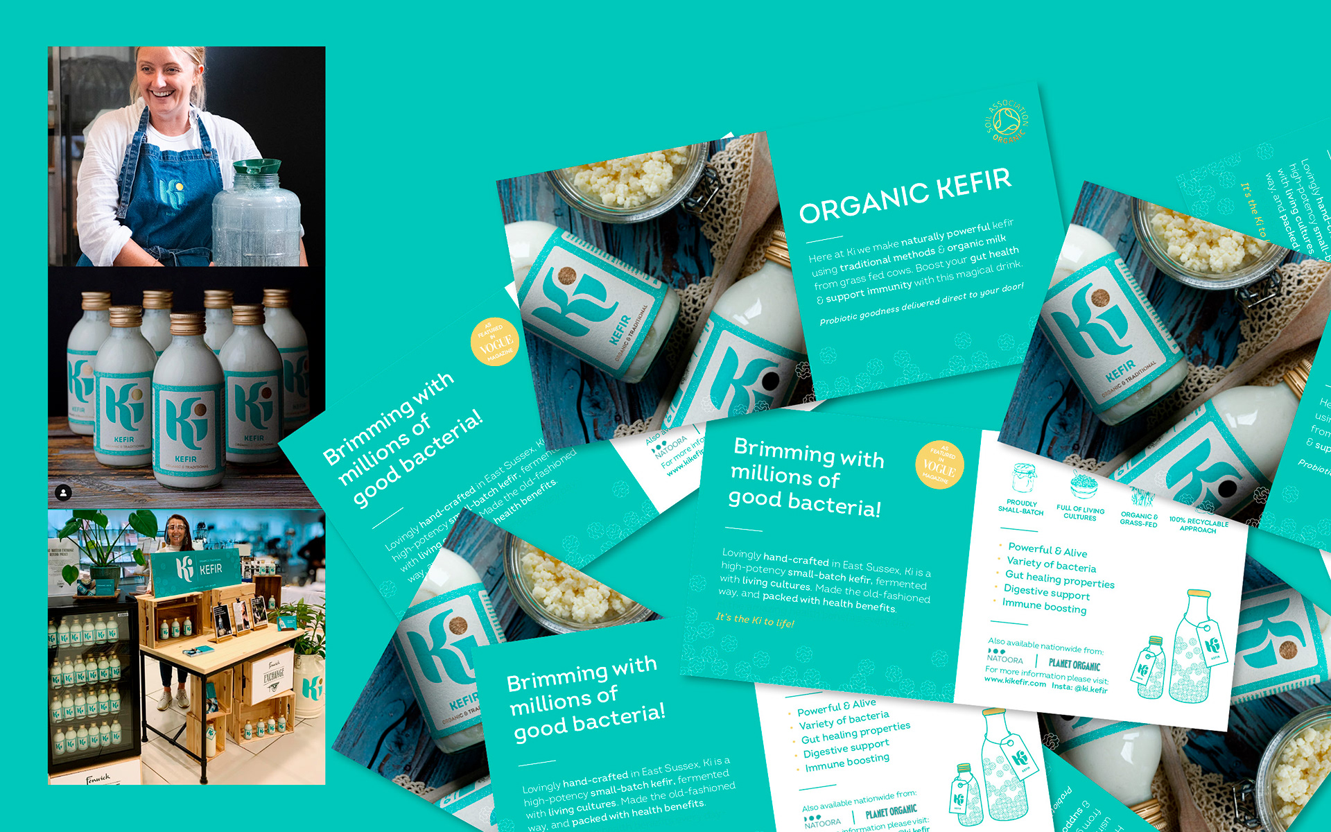
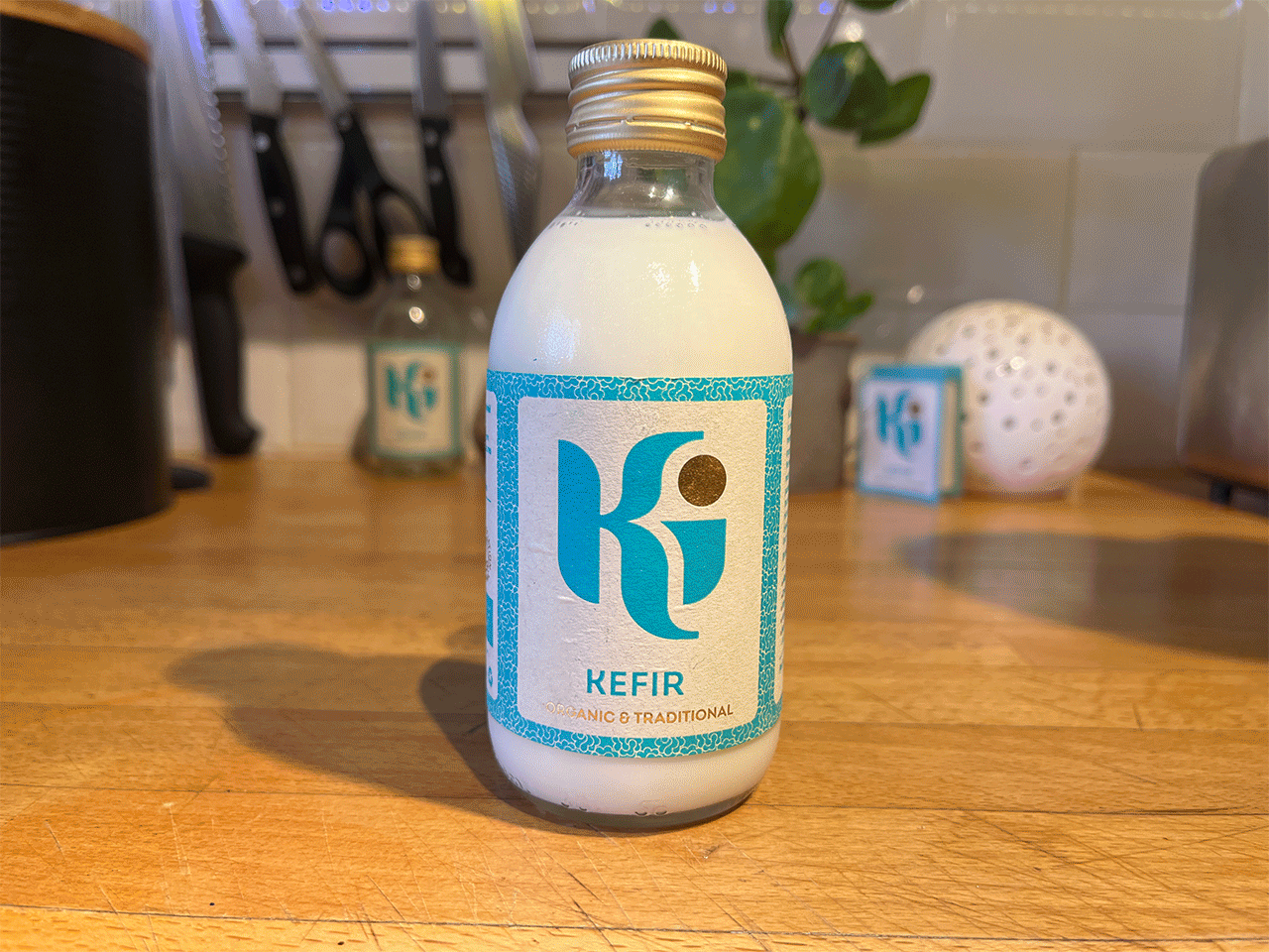
200ml Retail bottle
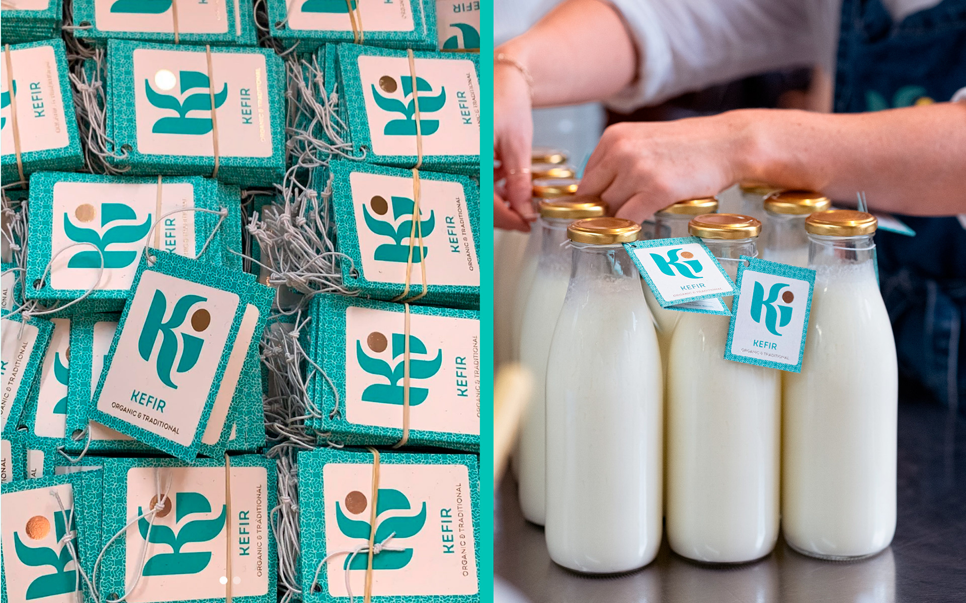
Subscription bottle tags - easily removable for recycling
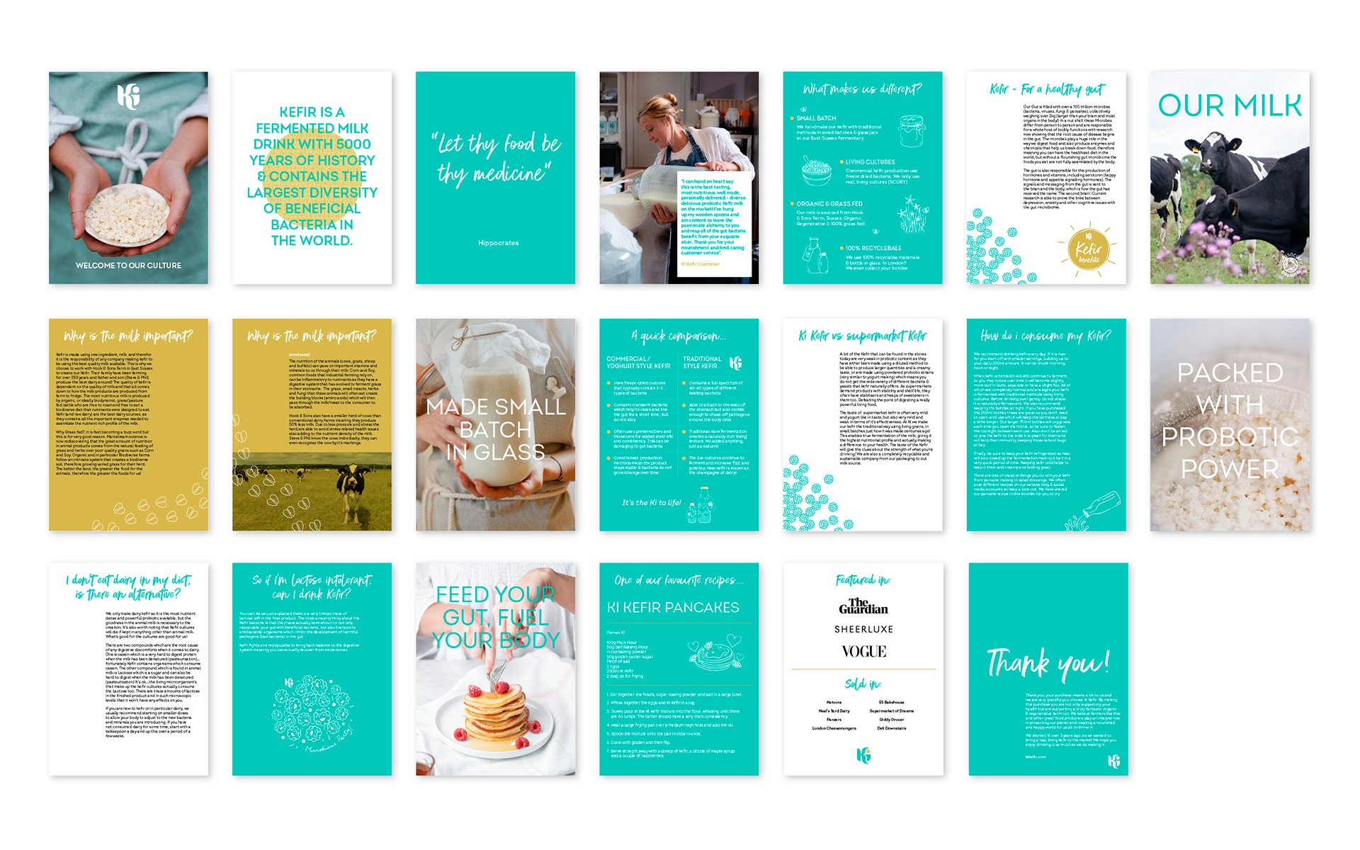
Digital welcome brochure
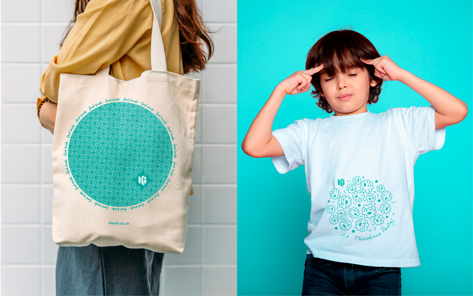
Grown-ups vs. kids promotional merchandise
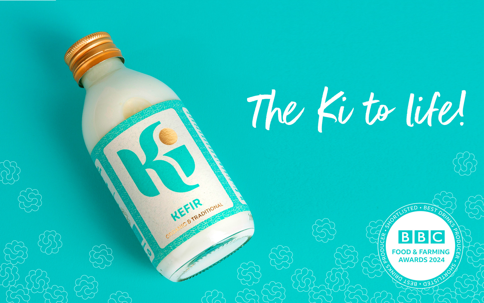
Judges discussion - no I didn't pay them!